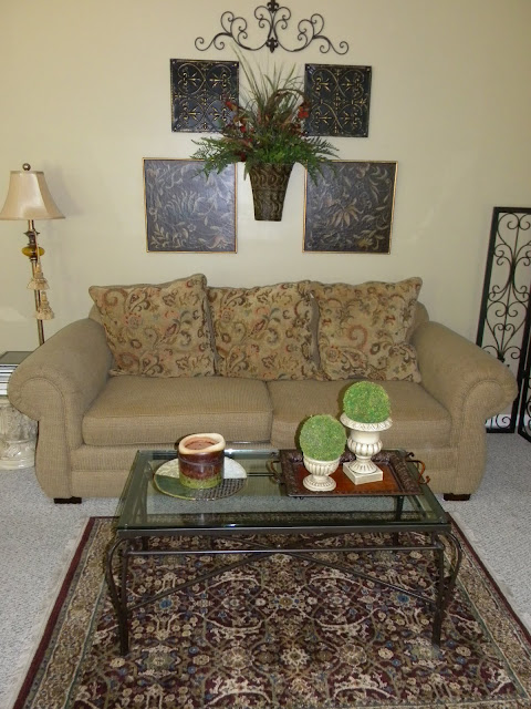
Here's an example. I recently rearranged the wallscape over the sofa in my Family Room. Previously it looked like this.
I started thinking it needed something on either side.
Then came this.
Lived with it for a while, but still thought it needed something.
So I added these.
That seemed like too wide of a wallscape for me, so I removed the large mirror (it ended up over the sofa in my Living Room - love it there!) and came up with this.
Liked the concept better, but still wasn't quite there.
Tweaked some more and voila!
Perfection. Well, my idea of perfection anyway. I love it now and this is how it's going to stay for a long time.
I'll break down what I did.
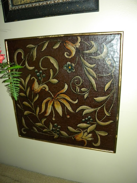
These two coordinating prints were purchased at a yardsale for $5 for both.
I found these framed pictures at one of my favorite local decor shops and thought the colors went perfectly with the prints above. And I absolutely love the worn look of the frames. They actually have a weathered texture to them.
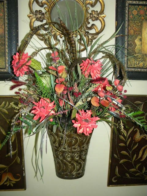
Next I added a floral arrangement that I made to the middle for some color and interest. I found the pretty red stems at the same shop as the pictures.
The pretty little mirror was a yardsale find for only $1. Of course I had to have it. I didn't even know where I was going to put it, but I think it completes this wallscape just perfectly.
The final touch was the wrought iron scroll I ordered from Hobby Lobby online.
I'm so happy with this wall now. I think it really warms up the room.
Oddly enough we will soon be remodeling this room. The walls are going to be painted, not sure what color yet, but I'm thinking something in a rich gold. New carpeting will be ordered and we'll be shopping for a new sofa/loveseat. I'll be looking for something neutral to complement these pictures. It's kind of backwards, I know. Usually artwork is the finishing touch, but in my case it's the inspiration for the whole room.
Thanks for stopping by and have a fabulicious day!
xoxo,
Kim


18 comments:
Looks great! Isn't it funny how we have a mind's eye of what things should look like! I can't seem to explain this to my husband.
I love this!!! Sounds like something I would do! Sometimes I think I give up to easily, but I know in my mind what I want. So...reading this blog, I've just found out Hobby Lobby is ONLINE. How lame am I?! I'm going there next!!
http://mtashie-theplace.blogspot.com/
I think that'sit Kim!~ I like the balance and symmetry now. Good job girl!
I do that too! I love using artwork as inspiration. It looks great Kim.
I so get what you're saying. I have a wall in my living room that's been bugging me. Big oil painting & I think I need something on the sides but don't know what, don't want to take away from the painting, blah, blah, blah! I like what you did!
Your room looks great!! I loved scrolling down as you added and changed with the finale being the red flowers. It truly is warm and inviting now. Hugs, Jan
Looks great, Kim! Love the addition of the pretty little mirror!!
Pretty - you did good! :) I also tend to lean towards symmetry.
Hi Kim,
I wanted to stop by and thank you for your visit and for becoming my newest follower! I love your ideas here and the dresser LOVE!! I was also looking at your yard sale finds Nice!
Thanks again and I hope to see you soon,
Chlvie
I think the mirror is my favorite part of the wall grouping.
Kim, Your wall looks GREAT! I know what you mean about looking and tweaking till you get it just the way you want it.
My family room wall was blank for a long time, then I had shelves and got rid of those and finally found a picture that worked with sconces on either side.
I really like your pictures and the flowers in the center add that pop of color. Can't wait to see what new things you get.
Hugs,
Babs
I do! I know that feeling, Kim! Sometimes I just can't pinpoint what it is so I leave it alone and when I walk by I look in the room in question. Sometimes I'll take things down and see if that makes a difference to how I feel.
Kim, I love the new look, but that mirror was fabulous...hope you aren't getting rid of it!
How is the baby doing?
Looks great, Kim!! I do the same thing. It seems as though most of the time the first time you do something it isn't ever right and you have to keep tweaking. Love the arrangement on the wall looks great! Your tweaking paid off :)
Your so right about our minds eye. You have this done just right. Its kinda hard for me to do this as I am always doing it on the thrifty side....but thats me and what I like doing. Trish
Kim, your wall looks perfect now. I hope you put everything back like it is now after you paint your walls!!! :D
Looks beautiful, Kim! The flowers could be tweaked with fall and holiday looking stuff, if you wanted. But I think it looks really complete! Your prints look great together, That's a pretty little mirror. I don't think it's backwards at all, to redecorate based on the accent pieces you love. You have such a flair for arranging things! I can tell you love your home! Blessings!
Kim ... I had to laugh reading your post because this is SOOO me! And, I'm willing to bet that you and I might be tied for the most amount of holes in our walls for tweaking! LOL. I love this new wall grouping ... the elements and textures you combined work so well together! Love it!
Post a Comment